Brand Resource Center
The American Academy of Orthopaedic Surgeons (AAOS) brand is more than just the logo. Color palettes, fonts and photography make up the look and feel of how an organization is represented in the minds of members, staff, partners and the public.
Color Palette, Color Codes and Usage
The primary color palette ensures that the “O” mark stands out from the neutral tone of the other letters. The core colors are meant to be bold, have great visual impact and deliver higher energy to various forms of communication they are used on.
The grey compliment (PMS 425) was chosen as the principal AAOS logo color as it is a dark silver that evokes dignity and permanence.
The Academy Red (PMS 186) was chosen because it is warm, approachable and inviting.
The Association Blue (PMS 661) is more formal and aligns with our role in Advocacy. This is an evolution of the blue that was used in the previous Association logo.
The AAOS logo may only be produced in Paper White or Registration Black. The Activity Circle may only be reproduced in Paper White, Registration Black, Academy Red or Association Blue. If the logotype is Paper White, the activity circle must also be Paper White.
Secondary colors Teal, Orange and Purple may be used as additional design colors. Shades of each secondary color may be used to differentiate products or concepts.
Best practices for designing branded AAOS assets include adhering to the 60% - 30% - 10% rule. To bring balance to a design, colors should be combined in this proportion, with the primary color used in 60% of the space, the secondary color used in 30% of the space and the accent color used in the remaining 10% of the space.
When using the Academy Red as a primary brand color, it is recommended to use 60% Paper White, 30% Academy Red and 10% Grey Compliment. This proportion of colors gives enough white space to the material without having the red become overpowering.
Primary Colors

Academy Red
PMS (Print): 186
CMYK (Print): 0, 100, 81, 4
RGB (Digital): 204, 0, 51
HEX (Digital): CC0033

Association Blue
PMS (Print): 661
CMYK (Print): 100, 69, 0, 9
RGB (Digital): 0, 53, 148
HEX (Digital): 003594
Secondary Colors

Grey Compliment
PMS(Print): 186
CMYK (Print): 0,0,0,77
RGB (Digital): 89, 89, 89
HEX (Digital): 595959

Teal
PMS (Print): 2220
CMYK (Print): 73, 24, 28, 0
RGB (Digital): 62, 154, 172
HEX (Digital): 3E9AAC

Orange
PMS (Print): 7550
CMYK (Print): 15, 38, 100, 1
RGB (Digital): 218, 160, 41
HEX (Digital): DAA029

Purple
PMS (Print): 246
CMYK (Print): 37, 88, 7, 0
RGB (Digital): 168, 67, 143
HEX (Digital): A8438F

Registration Black
RGB (Digital): 0,0,0

Paper White
RGB (Digital): 255, 255, 255
*The colors shown above have not been evaluated by PANTONE, Inc. for accuracy and may not match the actual PANTONE color standards.
Fonts and Typography
The AAOS logo is set in all caps, giving the mark an air of authority and dignity that is respectful of the past.
The logo font is Gilgamesh. The fonts used in the logo, lockups, etc. cannot be altered or substituted. Gilgamesh is used in the AAOS logo and should not be used for any other purposes in conjunction with AAOS communications. Vendors should only use a fully assembled logo image file provided by AAOS and not rebuild or recolor it.
Using suggested fonts within any branded materials will create consistency and reinforce the brand. However, our preferred brand fonts may not always be available for use in Word documents, PowerPoint presentations or other digital programs. This table serves as a guide for which fonts to use as substitutes.
Font Options
Photography and Illustrations
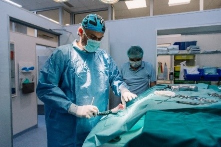
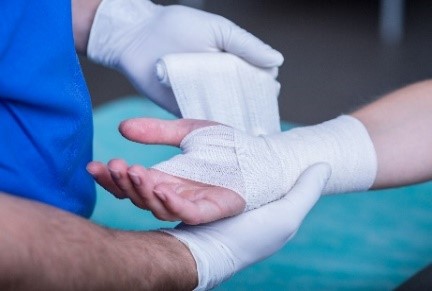
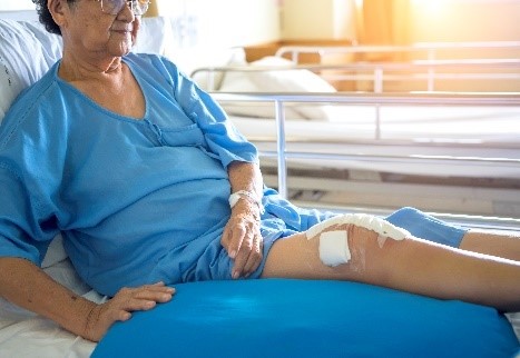
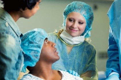
The imagery guidelines discussed here apply primarily to promotional and public-facing materials. The preferred image style for AAOS materials is to represent members as honest, straight-forward, caring and approachable, especially when interacting with patients. All AAOS imagery should reflect the key message themes that the organization strives to represent.
Images should reflect our organization’s professional expertise while conveying openness to the public and empathetic patient care. Patients in images should be treated respectfully with regards to clothing and positioning.
Represent our members as orthopaedic surgeons with appropriate equipment and avoid non-orthopaedic instruments such as stethoscopes. Photos and designed imagery should employ pleasant lighting and bright, optimistic settings.
Imagery should represent the full diversity of our members and the patients they serve in terms of age, sex, race, culture and orthopaedic practice area.
Employee requests for owned and stock photography can be sourced by submitting a Jotform.
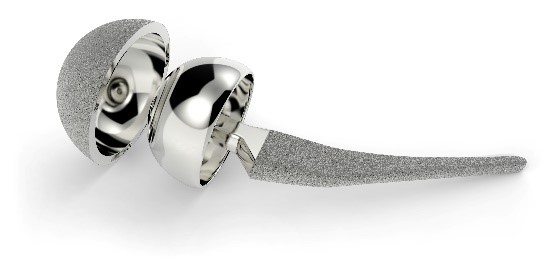
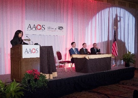
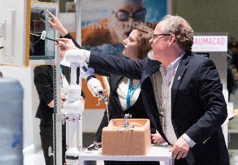
Examples of Preferred Photography Style


Can't find what you're looking for? Email the Branding Team or download the full AAOS Brand Guide (PDF).